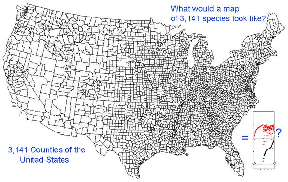
Growing barcode libraries challenge understanding. There are already about 200,000 mtCOI barcodes from about 25,000 species in BOLD, the Barcode of Life Data Systems Database. The burgeoning data sets hint at insights into biological diversity, revealed by looking at many species at once. A map of counties of the United States shows both large and small scale patterns, shaped by history, geography, and politics. Viewed through the lens of mitochondrial variation, what would a map of species show? Are differences among and within species similar in birds and butterflies? Do species boundaries differ in marine vs terrestrial species, or in tropical vs. temperate zones?
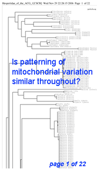 Here I offer one possible way of visualizing differences in barcode data sets using as an example the BOLD “Hesperiidae of the ACG 1” Project containing 2,185 COI sequences from 355 species of skipper butterfly in ACG conservation area in Costa Rica (Hajibabei et al Proc Natl Acad Sci USA 2006 103:968). The BOLD-generated neighbor-joining tree of ACG Hesperiid COI sequences shown at left offers a traditional way of comparing sequences and is an essential step in looking at individual species and their close genetic neighbors. However the NJ tree contains only about 100 sequences from 20 species per page, and so runs to 22 pages. In the future it will likely be desirable to compare much larger data sets from, say, all 3700 known species of world skipper butterflies.
For DNA barcoding, the essential information is differences among and within species. The higher-level groupings of species which are inevitably generated by a tree are of less interest. (In the following analysis distances are used simply to examine patterns of variation, NOT to determine whether they are sufficient for diagnosing species.)
One useful approach is to generate histograms of differences within and between species. BOLD has a “Nearest Neighbor” analytic function which generates a table of mean and maximum variation within each species, “nearest neighbor” distance to the next closest species, and histogram summaries of the results.
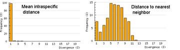 The histograms quickly show distances within most species are small and minimum distances between species are generally larger. Histograms are summaries with unlimited capacity. However, one might want to know more about individual species. For example, do species with higher intraspecific distances also show greater interspecific distances? One also wonders about the variation below 1% in both panels. In Beautiful Evidence, Edward Tufte points out histograms display relatively small amounts of data, usually 1 value per column. How to generate something with more information, more like the US Counties map, but not 22 pages long?
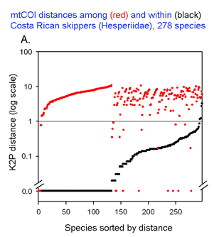
The graph at left uses the same 2 essential parameters: distance within each species and distance to nearest genetic neighbor. Because the usual distances within and between species are very different, plotting on a logarithmic scale allows one to inspect the variation in each set simultaneously. The results with 278 of the ACG skipper species (all those for which more than one individual was sampled, thereby generating a mean intraspecific distance) are shown. For each species, there is a black dot showing intraspecific distance and a red dot directly above or below showing distance to nearest neighbor. Sorting by intra- and interspecific distance allows the relative distances for each species to be seen. This graph highlights the relatively few species with nearest neighbor distances less than the mean intraspecific distance for that species. A line drawn at 1% appears to separate most of the intraspecific from interspecific values.
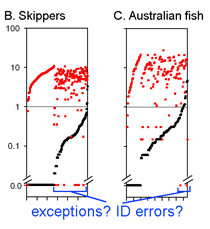 This graph is remarkably compressible, as shown by the small inset in the US county map above and in the figure at right. Here this is used to compare variation in Costa Rican skippers (278 species in 1 Family) to that in Australian fish (172 species in 1 Class) (Ward et al 2006 Phil Trans Royal Soc B 360:1471). The distribution of intraspecific variation seems quite similar while the nearest neighbor distances in fish are higher, presumably reflecting less dense sampling of a larger taxon. In the Fish paper, the red dots at bottom were thought to be ID errors, so perhaps some of the those in the skipper data set showing zero distance between species are taxonomic errors as well. This graphic approach could be useful in comparing patterning of intra- and inter-specific variation in marine vs terrestrial, tropical vs temperate, and allopatric vs sympatric species.