Citation: Technology in Society 23 (2): 131–146 2001
PDF Full Text: Death and the Human Environment: The United States in the 20th Century
Causes of death varied systematically in the United States during the 20th century as the human environment came under control. Infections became less deadly, while heart disease grew dominant, followed by cancer. Logistic models of growth and multi-species competition in which the causes of death are the competitors describe precisely the evolutionary success of the killers. We shows the dossiers of typhoid, diphtheria, cholera, tuberculosis, pneumonia/influenza, heart disease, cancer, and AIDS. Improvements in water and air supply and other aspects of the environment provided cardinal defenses against infection. We project cancer will overtake heart disease as the leading cause of death about 2015, and infections may gradually regain their deadly edge.
Keywords: Mortality, epidemiological transition, morbidity
Areas of Research: Cities and Transportation, Diffusion of Social Phenomena
AN INTRODUCTION TO DEADLY COMPETITION
Our subject is the history of death. Researchers have analyzed the time dynamics of numerous populations-nations, companies, products, technologies–competing to fill a niche or provide a given service. Here we review killers, causes of death, as competitors for human bodies. We undertake the analysis to understand better the role of the environment in the evolution of patterns of mortality. Some of the story will prove familiar to public health experts. The story begins in the environment of water, soil, and air, but it leads elsewhere.
Our method is to apply two models developed in ecology to study growth and decline of interacting populations. These models, built around the logistic equation, offer a compact way of organizing numerous data and also enable prediction. The first model represents simple S-shaped growth or decline.[1] The second model represents multiple, overlapping and interacting processes growing or declining in S-shaped paths.[2] Marchetti first suggested the application of logistic models to causes of death in 1982.[3]
The first, simple logistic model assumes that a population grows exponentially until an upper limit inherent in the system is approached, at which point the growth rate slows and the population eventually saturates, producing a characteristic S-shaped curve. A classic example is the rapid climb and then plateau of the number of people infected in an epidemic. Conversely, a population such as the uninfected sleds downward in a similar logistic curve. Three variables characterize the logistic model: the duration of the process (Dt), defined as the time required for the population to grow from 10 percent to 90 percent of its extent; the midpoint of the growth process, which fixes it in time and marks the peak rate of change; and the saturation or limiting size of the population. For each of the causes of death that we examine, we analyze this S-shaped “market penetration” (or withdrawal) and quantify the variables.
Biostatisticians have long recognized competing risks, and so our second model represents multi-species competition. Here causes of death compete with and, if fitter in an inclusively Darwinian sense, substitute for one another. Each cause grows, saturates, and declines, and in the process reduces or creates space for other causes within the overall niche. The growth and decline phases follow the S-shaped paths of the logistic law.
The domain of our analysis is the United States in the 20th century. We start systematically in the year 1900, because that is when reasonably reliable and complete U.S. time series on causes of death begin. Additionally, 1900 is a commencement because the relative importance of causes of death was rapidly and systematically changing. In earlier periods causes of death may have been in rough equilibrium, fluctuating but not systematically changing. In such periods, the logistic model would not apply. The National Center for Health Statistics and its predecessors collect the data analyzed, which are also published in volumes issued by the U.S. Bureau of the Census.[4]
The data present several problems. One is that the categories of causes of death are old, and some are crude. The categories bear some uncertainty. Alternative categories and clusters, such as genetic illnesses, might be defined for which data could be assembled. Areas of incomplete data, such as neonatal mortality, and omissions, such as fetal deaths, could be addressed. To complicate the analysis, some categories have been changed by the U.S. government statisticians since 1900, incorporating, for example, better knowledge of forms of cancer.
Other problems are that the causes of death may be unrecorded or recorded incorrectly. For a decreasing fraction of causes of death, no “modern” cause is assigned. We assume that the unassigned or “other” deaths, which were numerous until about 1930, do not bias the analysis of the remainder. That is, they would roughly pro-rate to the assigned causes. Similarly, we assume no systematic error in early records.
Furthermore, causes are sometimes multiple, though the death certificate requires that ultimately one basic cause be listed.[5] This rule may hide environmental causes. For example, infectious and parasitic diseases thrive in populations suffering drought and malnutrition. The selection rule dictates that only the infectious or parasitic disease be listed as the basic cause. For some communities or populations the bias could be significant, though not, we believe, for our macroscopic look at the 20th century United States.
The analysis treats all Americans as one population. Additional analyses could be carried out for subpopulations of various kinds and by age group.[6] Comparable analyses could be prepared for populations elsewhere in the world at various levels of economic development.[7]
With these cautions, history still emerges.
As a reference point, first observe the top 15 causes of death in America in 1900 (Table 1). These accounted for about 70 percent of the registered deaths. The remainder would include both a sprinkling of many other causes and some deaths that should have been assigned to the leading causes. Although heart disease already is the largest single cause of death in 1900, the infectious diseases dominate the standings.
Death took 1.3 million in the United States in 1900. In 1997 about 2.3 million succumbed. While the population of Americans more than tripled, deaths in America increased only 1.7 times because the death rate halved (Figure 1). As we shall see, early in the century the hunter microbes had better success.
Table 1. U.S. death rate per 100,000 population for leading causes, 1900. For source of data, see Note 4.
| Cause | Rate | Mode of Transmission | |
| 1. | Major Cardiovascular Disease | 345 | [N.A.] |
| 2. | Influenza, Pneumonia | 202 | Inhalation,Intimate Contact |
| 3. | Tuberculosis | 194 | Inhalation,Intimate Contact |
| 4. | Gastritis, Colitus,Enteritis, and Duodenitis | 142 | Contaminated Waterand Food |
| 5. | All Accidents | 72 | [Behavioral] |
| 6. | Malignant Neoplasms | 64 | [N.A.] |
| 7. | Diphtheria | 40 | Inhalation |
| 8. | Typhoid and ParatyphoidFever | 31 | Contaminated Water |
| 9. | Measles | 13 | Inhalation, Intimate Contact |
| 10. | Cirrhosis | 12 | [Behavioral] |
| 11. | Whooping Cough | 12 | Inhalation, Intimate Contact |
| 12. | Syphilis and Its Sequelae | 12 | Sexual Contact |
| 13. | Diabetes Mellitus | 11 | [N.A.] |
| 14. | Suicide | 10 | [Behavioral] |
| 15. | Scarlet Fever and Streptococcal Sore Throat | 9 | Inhalation, Intimate Contact |
DOSSIERS OF EIGHT KILLERS
Let us now review the histories of eight causes of death: typhoid, diphtheria, the gastrointestinal family, tuberculosis, pneumonia plus influenza, cardiovascular, cancer, and AIDS.
For each of these, we will see first how it competes against the sum of all other causes of death. In each figure we show the raw data, that is, the fraction of total deaths attributable to the killer, with a logistic curve fitted to the data. In an inset, we show the identical data in a transform that renders the S-shaped logistic curve linear.[8] It also normalizes the process of growth or decline to one (or to 100 percent). Thus, in the linear transform the fraction of deaths each cause garners, which is plotted on a semi-logarithmic scale, becomes the percent of its own peak level (taken as one hundred percent). The linear transform eases the comparison among cases and the identification of the duration and midpoint of the processes, but also compresses fluctuations.
Typhoid (Figure 2) is a systemic bacterial infection caused primarily by Salmonella typhi.[9] Mary Mallon, the cook (and asymptomatic carrier) popularly known as Typhoid Mary, was a major factor in empowering the New York City Department of Health at the turn of the century. Typhoid was still a significant killer in 1900, though spotty records show it peaked in the 1870s. In the 1890s, Walter Reed, William T. Sedgewick, and others determined the etiology of typhoid fever and confirmed its relation to sewage-polluted water. It took about 40 years to protect against typhoid, with 1914 the year of inflection or peak rate of decline.
Diphtheria (Figure 2) is an acute infectious disease caused by diphtheria toxin of the Corynebacterium diphtheriae. In Massachusetts, where the records extend back further than for the United States as a whole, diphtheria flared to 196 per 100,000 in 1876, or about 10 percent of all deaths. Like typhoid, diphtheria took 40 years to defense, centered in 1911. By the time the diphtheria vaccine was introduced in the early 1930s, 90 percent of its murderous career transition was complete.
Next comes the category of diseases of the gut (Figure 2). Deaths here are mostly attributed to acute dehydrating diarrhea, especially in children, but also to other bacterial infections such as botulism and various kinds of food poisoning. The most notorious culprit was the Vibrio cholerae. In 1833, while essayist Ralph Waldo Emerson was working on his book Nature, expounding the basic benevolence of the universe, a cholera pandemic killed 5 to 15 percent of the population in many American localities where the normal annual death rate from all causes was 2 or 3 percent.
In 1854 in London a physician and health investigator, John Snow, seized the idea of plotting the locations of cholera deaths on a map of the city. Most deaths occurred in St. James Parish, clustered about the Broad Street water pump. Snow discovered that cholera victims who lived outside the Parish also drew water from the pump. Although consumption of the infected water had already peaked, Snow’s famous removal of the pump handle properly fixed in the public mind the means of cholera transmission.[10] In the United States, the collapse of cholera and its relations took about 60 years, centered on 1913. As with typhoid and diphtheria, sanitary engineering and public health measures addressed most of the problem before modern medicine intervened with antibiotics in the 1940s.
In the late 1960s, deaths from gastrointestinal disease again fell sharply. The fall may indicate the widespread adoption of intravenous and oral rehydration therapies and perhaps new antibiotics. It may also reflect a change in record-keeping.
Tuberculosis (Figure 2) refers largely to the infectious disease of the lungs caused by Mycobacterium tuberculosis. In the 1860s and 1870s in Massachusetts, TB peaked at 375 deaths per 100,000, or about 15 percent of all deaths. Henry David Thoreau, author of Walden: or, Life in the Woods, died of bronchitis and tuberculosis at the age of 45 in 1862. TB took about 53 years to jail, centered in 1931. Again, the pharmacopoeia entered the battle rather late. The multi-drug therapies became effective only in the 1950s.
Pneumonia and influenza are combined in Figure 3. They may comprise the least satisfactory category, mixing viral and bacterial aggressors. Figure 3 includes Influenza A, the frequently mutating RNA virus believed to have induced the Great Pandemic of 1918-1919 following World War I, when flu seized about a third of all corpses in the United States. Pneumonia and influenza were on the loose until the 1930s. Then, in 17 years centered on 1940 the lethality of pneumonia and influenza tumbled to a plateau where “flu” has remained irrepressibly for a half century.
Now we shift from pathogens to a couple of other major killers. Major cardiovascular diseases, including heart disease, hypertension, cerebrovascular diseases, atherosclerosis, and associated renal diseases display their triumphal climb and incipient decline in Figure 3. In 1960, about 55 percent of all fatal attacks were against the heart and its allies, culminating a 60-year climb. Having lost 14 points of market share in the past 40 years, cardiovascular disease looks vulnerable. Other paths descend quickly, once they bend downward. We predict an 80-year drop to about 20 percent of American dead. Cardiovascular disease is ripe for treatment through behavioral change and medicine.
A century of unremitting gains for malignant neoplasms appears neatly in Figure 3. According to Ames et al., the culprits are ultimately the DNA-damaging oxidants.[11] One might argue caution in lumping together lung, stomach, breast, prostate, and other cancers. Lung and the other cancers associated with smoking account for much of the rising slope. However, the cancers whose occurrence has remained constant are also winning share if other causes of death diminish. In the 1990s the death rate from malignancies flattened, but the few years do not yet suffice to make a trend. According to the model, cancer’s rise should last 160 years and at peak account for 40 percent of American deaths.
The spoils of AIDS, a meteoric viral entrant, are charted in Figure 3. The span of data for AIDS is short, and the data plotted here may not be reliable. Pneumonia and other causes of death may mask AIDS’ toll. Still, this analysis suggests AIDS reached its peak market of about 2 percent of deaths in the year 1995. Uniquely, the AIDS trajectory suggests medicine sharply blocked a deadly career, stopping it about 60% of the way toward its project fulfillment.
Now look at the eight causes of death as if it were open hunting season for all (Figure 4). Shares of the hunt changed dramatically, and fewer hunters can still shoot to kill with regularity. We can speculate why.
BY WATER, BY AIR
First, consider what we label the aquatic kills: a combination of typhoid and the gastrointestinal family. They cohere visually and phase down by a factor of ten over 33 years centered on 1919 (Figure 5).
Until well into the 19th century, towndwellers drew their water from local ponds, streams, cisterns, and wells.[12] They disposed of the wastewater from cleaning, cooking, and washing by throwing it on the ground, into a gutter, or a cesspool lined with broken stones. Human wastes went to privy vaults, shallow holes lined with brick or stone, close to home, sometimes in the cellar. In 1829 residents of New York City deposited about 100 tons of excrement each day in the city soil. Scavengers collected the “night soil” in carts and dumped it nearby, often in streams and rivers.
Between 1850 and 1900 the share of the American population living in towns grew from about 15 to about 40 percent. The number of cities over 50,000 grew from 10 to more than 50. Increasing urban density made waste collection systems less adequate. Overflowing privies and cesspools filled alleys and yards with stagnant water and fecal wastes. The growing availability of piped-in water created further stress. More water was needed for fighting fires, for new industries that required pure and constant water supply, and for flushing streets. To the extent they existed, underground sewers were designed more for storm water than wastes. One could not design a more supportive environment for typhoid, cholera, and other water-borne killers.
By 1900 towns were building systems to treat their water and sewage. Financing and constructing the needed infrastructure took several decades. By 1940 the combination of water filtration, chlorination, and sewage treatment stopped most of the aquatic killers.
Refrigeration in homes, shops, trucks, and railroad boxcars took care of much of the rest. The chlorofluorocarbons (CFCs) condemned today for thinning the ozone layer were introduced in the early 1930s as a safer and more effective substitute for ammonia in refrigerators. The ammonia devices tended to explode. If thousands of Americans still died of gastrointestinal diseases or were blown away by ammonia, we might hesitate to ban CFCs.
Let us move now from the water to the air (Figure 6). “Aerial” groups all deaths from influenza and pneumonia, TB, diphtheria, measles, whooping cough, and scarlet fever and other streptococcal diseases. Broadly speaking these travel by air. To a considerable extent they are diseases of crowding and unfavorable living and working conditions.
Collectively, the aerial diseases were about three times as deadly to Americans as their aquatic brethren in 1900. Their breakdown began more than a decade later and required almost 40 years.
The decline could be decomposed into several sources. Certainly large credit goes to improvements in the built environment: replacement of tenements and sweatshops with more spacious and better ventilated homes and workplaces. Huddled masses breathed free. Much credit goes to electricity and cleaner energy systems at the level of the end user.
Reduced exposure to infection may be an unrecognized benefit of shifting from mass transit to personal vehicles. Credit obviously is also due to nutrition, public health measures, and medical treatments.
The aerial killers have kept their market share stable since the mid-1950s. Their persistence associates with poverty; crowded environments such as schoolrooms and prisons; and the intractability of viral diseases. Mass defense is more difficult. Even the poorest Bostonians or Angelenos receive safe drinking water; for the air, there is no equivalent to chlorination.
Many aerial attacks occurred in winter, when indoor crowding is greatest. Many aquatic kills were during summer, when the organic fermenters were speediest. Diarrhea was called the summer complaint. In Chicago between 1867 and 1925 a phase shift occurred in the peak incidence of mortality from the summer to the winter months.[13] In America and other temperate zone industrialized countries, the annual mortality curve has flattened during this century as the human environment has come under control. In these countries, most of the faces of death are no longer seasonal.
BY WAR, BY CHANCE?
Let us address briefly the question of where war and accidents fit. In our context we care about war because disputed control of natural resources such as oil and water can cause war. Furthermore, war leaves a legacy of degraded environment and poverty where pathogens find prey. We saw the extraordinary spike of the flu pandemic of 1918-1919.
War functions as a short-lived and sometimes intense epidemic. In this century, the most intense war in the developed countries may have been in France between 1914-1918, when about one-quarter of all deaths were associated with arms.[14] The peak of 20th century war deaths in the United States occurred between 1941-1945 when about 7 percent of all deaths were in military service, slightly exceeding pneumonia and influenza in those years.
Accidents, which include traffic, falls, drowning, and fire follow a dual logic. Observe the shares of auto and all other accidents in the total kills in the United States during this century (Figure 7). Like most diseases, fatal non-auto accidents have dropped, in this case rather linearly from about 6 percent to about 2 percent of all fatalities. Smiths and miners faced more dangers than office workers. The fall also reflects lessening loss of life from environmental hazards such as floods, storms, and heat waves.
Auto accidents do not appear accidental at all but under perfect social control. On the roads, we appear to tolerate a certain range of risk and regulate accordingly, an example of so-called risk homeostasis.[15] The share of killing by auto has fluctuated around 2 percent since about 1930, carefully maintained by numerous changes in vehicles, traffic management, driving habits, driver education, and penalties.
DEADLY ORDER
Let us return to the main story. Infectious diseases scourged the 19th century. In Massachusetts in 1872, one of the worst plague years, five infectious diseases, tuberculosis, diphtheria, typhoid, measles, and smallpox, alone accounted for 27 percent of all deaths. Infectious diseases thrived in the environment of the industrial revolution’s new towns and cities, which grew without modern sanitation.
Infectious diseases, of course, are not peculiarly diseases of industrialization. In England during the intermittent plagues between 1348-1374 half or more of all mortality may have been attributable to the Black Death.[16] The invasion of smallpox into Central Mexico at the time of the Spanish conquest depopulated central Mexico.[17] Gonorrhea depopulated the Pacific island of Yap.[18]
At the time of its founding in 1901, our institution, the Rockefeller Institute for Medical Research as it was then called, appropriately focused on the infectious diseases. Prosperity, improvements in environmental quality, and science diminished the fatal power of the infectious diseases by an order of magnitude in the United States in the first three to four decades of this century. Modern medicine has kept the lid on.[19]
If infections were the killers of reckless 19th century urbanization, cardiovascular diseases were the killers of 20th century modernization. While avoiding the subway in your auto may have reduced the chance of influenza, it increased the risk of heart disease. Traditionally populations fatten when they change to a “modern” lifestyle. When Samoans migrate to Hawaii and San Francisco or live a relatively affluent life in American Samoa, they gain between 10 and 30 kg.[20]
The environment of cardiovascular death is not the Broad Street pump but offices, restaurants, and cars. So, heart disease and stroke appropriately roared to the lead in the 1920s.
Since the 1950s, however, cardiovascular disease has steadily lost ground to a more indefatigable terminator, cancer. In our calculation, cancer passed infection for the #2 spot in 1945. Americans appear to have felt the change. In that year Alfred P. Sloan and Charles Kettering channeled some of the fortune they had amassed in building the General Motors Corporation to found the Sloan-Kettering Cancer Research Center.
Though cancer trailed cardiovascular in 1997 by 41 to 23 percent, cancer should take over as the nation’s #1 killer by 2015, if long-run dynamics continue as usual (Figure 8). The main reasons are not environmental. Doll and Peto estimate that only about 5 percent of U.S. cancer deaths are attributable to environmental pollution and geophysical factors such as background radiation and sunlight.[21]
The major proximate causes of current forms of cancer, particularly tobacco smoke and dietary imbalances, can be reduced. But if Ames and others are right that cancer is a degenerative disease of aging, no miracle drugs should be expected, and one form of cancer will succeed another, assuring it a long stay at the top of the most wanted list. In the competition among the three major families of death, cardiovascular will have held first place for almost 100 years, from 1920 to 2015.
Will a new competitor enter the hunt? As various voices have warned, the most likely suspect is an old one, infectious disease.[22] Growth of antibiotic resistance may signal re-emergence. Also, humanity may be creating new environments, for example, in hospitals, where infection will again flourish. Massive population fluxes over great distances test immune systems with new exposures. Human immune systems may themselves weaken, as children grow in sterile apartments rather than barnyards.[23] Probably most important, a very large number of elderly offer weak defense against infections, as age-adjusted studies could confirm and quantify. So, we tentatively but logically and consistently project a second wave of infectious disease. In Figure 9 we aggregate all major infectious killers, both bacterial and viral. The category thus includes not only the aquatics and aerials discussed earlier, but also septicemia, syphilis, and AIDS.[24] A grand and orderly succession emerges.
SUMMARY
Historical examination of causes of death shows that lethality may evolve in consistent and predictable ways as the human environment comes under control. In the United States during the 20th century infections became less deadly, while heart disease grew dominant, followed by cancer. Logistic models of growth and multi-species competition in which the causes of death are the competitors describe precisely the evolutionary success of the killers, as seen in the dossiers of typhoid, diphtheria, the gastrointestinal family, pneumonia/influenza, cardiovascular disease, and cancer. Improvements in water supply and other aspects of the environment provided the cardinal defenses against infection. Environmental strategies appear less powerful for deferring the likely future causes of death. Cancer will overtake heart disease as the leading U.S. killer around the year 2015 and infections will gradually regain their fatal edge. If the orderly history of death continues.
FIGURES
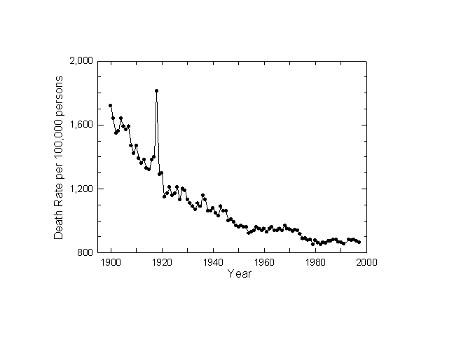
Figure 1. Crude Death Rate: U.S. 1900-1997. Sources of data: Note 4.
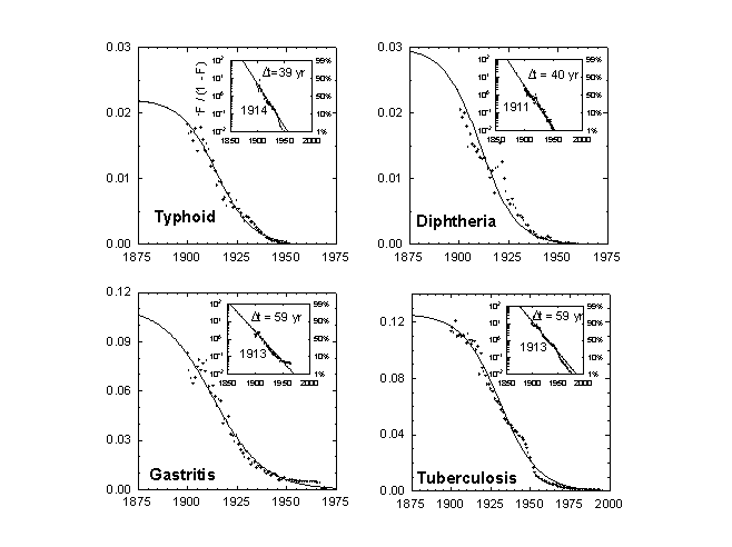
Figure 2a. Typhoid and Paratyphoid Fever as a Fraction of All Deaths: U.S. 1900-1952. The larger panel shows the raw data and a logistic curve fitted to the data. The inset panel shows the same data and a transform that renders the S-shaped curve linear and normalizes the process to 1. “F” refers to the fraction of the process completed. Here the time it takes the process to go from 10 percent to 90 percent of its extent is 39 years, and the midpoint is the year 1914. Source of data: Note 4.
Figure 2b. Diphtheria as a Fraction of All Deaths: U.S. 1900-1956. Source of data: Note 4.
Figure 2c. Gastritis, Duodenitis, Enteritis, and Colitis as a Fraction of All Deaths: U.S. 1900-1970. Source of data: Note 4.
Figure 2d. Tuberculosis, All Forms, as a Fraction of All Deaths: U.S. 1900-1997. Sources of data: Note 4.
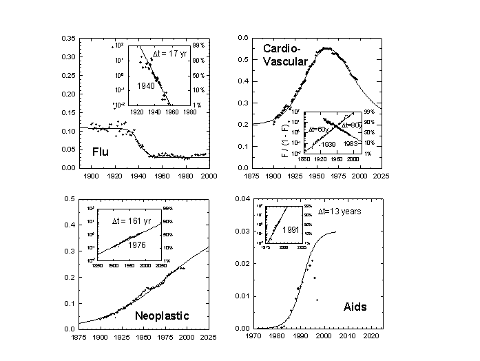
Figure 3a. Pneumonia and Influenza as a Fraction of All Deaths: U.S. 1900-1997. Note the extraordinary pandemic of 1918-1919. Sources of data: Note 4.
Figure 3b. Major Cardiovascular Diseases as a Fraction of All Deaths: U.S. 1900-1997. In the inset, the curve is decomposed into upward and downward logistics which sum to the actual data values. The midpoint of the 60-year rise of cardiovascular disease was the year 1939, while the year 1983 marked the midpoint of its 80-year decline. Sources of data: Note 4.
Figure 3c. Malignant Neoplasms as a Fraction of All Deaths: U.S. 1900-1997. Sources of data: Note 4.
Figure 3d. AIDS as a Fraction of All Deaths: U.S. 1981-1997. Sources of data: Note 4.
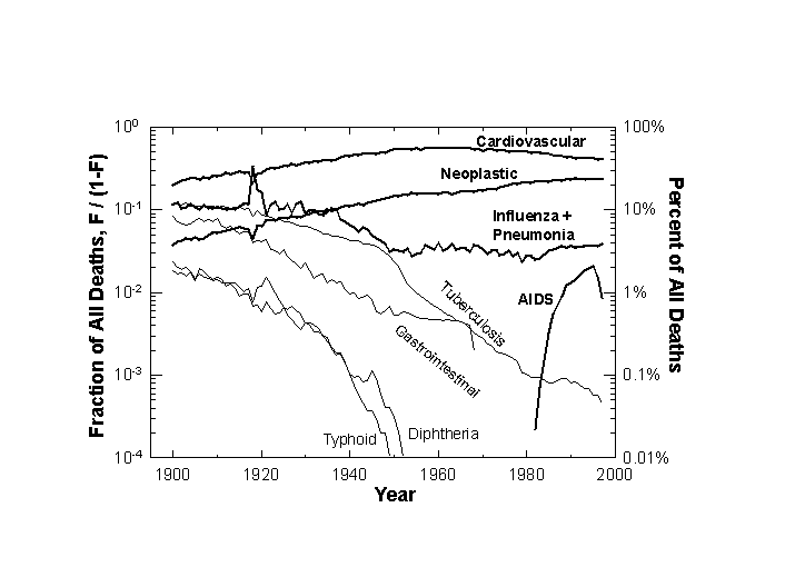
Figure 4. Comparative Trajectories of Eight Killers: U.S. 1900-1997. The scale is logarithmic, with fraction of all deaths shown on the left scale with the equivalent percentages marked on the right scale. Sources of data: Note 4.
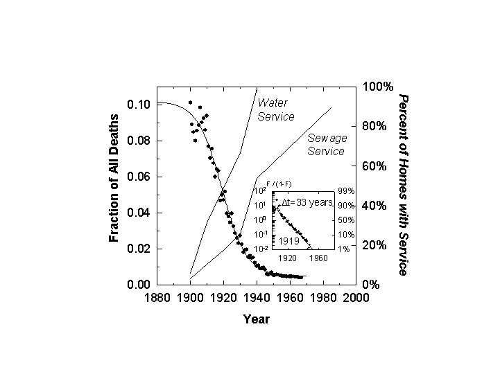
Figure 5. Deaths from Aquatically Transmitted Diseases as a Fraction of All Deaths: U.S. 1900-1967. Superimposed is the percentage of homes with water and sewage service (right scale). Source of data: Note 4.

Figure 6. Deaths from Aerially Transmitted Diseases as a Fraction of All Deaths: U.S. 1900-1997. Sources of data: Note 4.
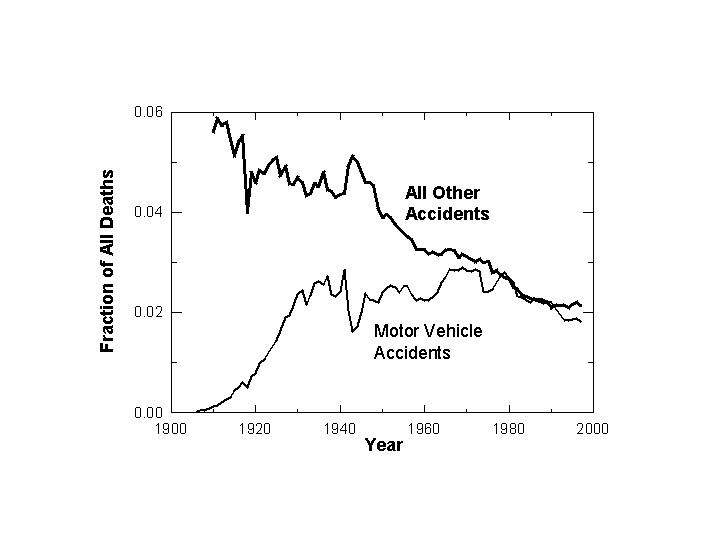
Figure 7. Motor Vehicle and All Other Accidents as a Fraction of All Deaths: U.S. 1900-1997. Sources of data: Note 4.
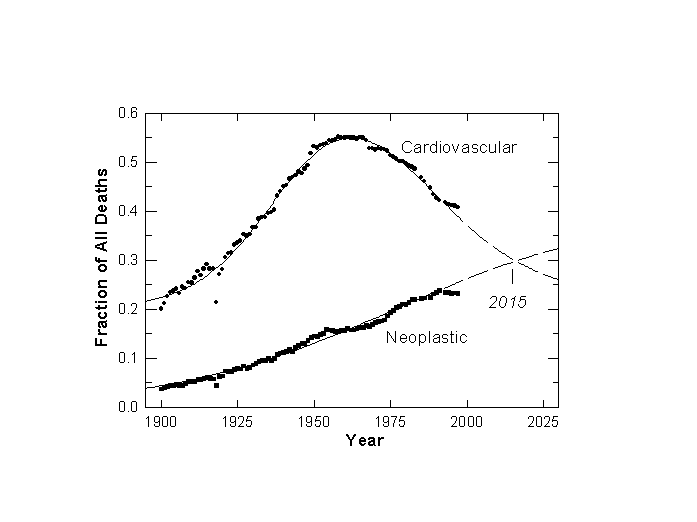
Figure 8. Major Cardiovascular Diseases and Malignant Neoplasms as a Fraction of All U.S. Deaths: 1900-1997. The logistic model predicts (dashed lines) Neoplastic will overtake Cardiovascular as the number one killer in 2015. Sources of data: Note 4.
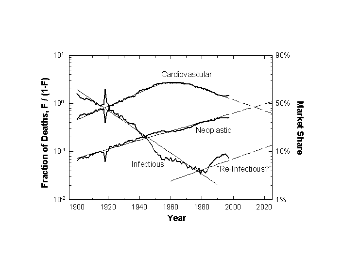
Figure 9. Major Causes of Death Analyzed with a Multi-species Model of Logistic Competition. The fractional shares are plotted on a logarithmic scale which makes linear the S-shaped rise and fall of market shares.
Notes
[1] On the basic model see: Kingsland SE. Modeling Nature: Episodes in the History of Population Ecology. Chicago: University of Chicago Press, 1985. Meyer PS. Bi-logistic growth. Technological Forecasting and Social Change 1994;47:89-102.
[2] On the model of multi-species competition see Meyer PS, Yung JW, Ausubel JH. A Primer on logistic growth and substitution: the mathematics of the Loglet Lab software. Technological Forecasting and Social Change 1999;61(3):247-271.
[3] Marchetti C. Killer stories: a system exploration in mortal disease. PP-82-007. Laxenburg, Austria: International Institute for Applied Systems Analysis, 1982. For a general review of applications see: Nakicenovic N, Gruebler A, eds. Diffusion of Technologies and Social Behavior. New York: Springer-Verlag, 1991.
[4] U.S. Bureau of the Census, Historical Statistics of the United States: Colonial Times to 1970, Bicentennial Editions, Parts 1 & 2. Washington DC: U.S. Bureau of the Census: 1975. U.S. Bureau of the Census, Statistical Abstract of the United States: 1999 (119th edition). Washington DC: 1999, and earlier editions in this annual series.
[5] Deaths worldwide are assigned a “basic cause” through the use of the “Rules for the Selection of Basic Cause” stated in the Ninth Revision of the International Classification of Diseases. Geneva: World Health Organization. These selection rules are applied when more than one cause of death appears on the death certificate, a fairly common occurrence. From an environmental perspective, the rules are significantly biased toward a medical view. In analyzing causes of death in developing countries and poor communities, the rules can be particularly. For general discussion of such matters see Kastenbaum R, Kastenbaum B. Encyclopedia of Death. New York: Avon, 1993.
[6] For discussion of the relation of causes of death to the age structure of populations see Hutchinson GE. An Introduction to Population Ecology. New Haven: Yale University Press, 1978, 41-89. See also Zopf PE Jr. Mortality Patterns and Trends in the United States. Westport CT: Greenwood, 1992.
[7] Bozzo SR, Robinson CV, Hamilton LD. The use of a mortality-ratio matrix as a health index.” BNL Report No. 30747. Upton NY: Brookhaven National Laboratory, 1981.
[8] For explanation of the linear transform, see Fisher JC, Pry RH. A simple substitution model of technological change. Technological Forecasting and Social Change 1971;3:75-88.
[9] For reviews of all the bacterial infections discussed in this paper see: Evans AS, Brachman PS, eds., Bacterial Infections of Humans: Epidemiology and Control. New York: Plenum, ed. 2, 1991. For discussion of viral as well as bacterial threats see: Lederberg J, Shope RE, Oaks SC Jr., eds., Emerging Infections: Microbial Threats to Health in the United States. Washington DC: National Academy Press, 1992. See also Kenneth F. Kiple, ed., The Cambridge World History of Disease. Cambridge UK: Cambridge Univ. Press, 1993.
[10] For precise exposition of Snow’s role, see Tufte ER. Visual Explanations: Images and Quantities, Evidence and Narrative. Cheshire CT: Graphics Press, 1997:27-37.
[11] Ames BN, Gold LS. Chemical Carcinogens: Too Many Rodent Carcinogens. Proceedings of the National Academy of Sciences of the U.S.A. 1987;87:7772-7776.
[12] Tarr JA. The Search for the Ultimate Sink: Urban Pollution in Historical Perspective. Akron OH: University of Akron Press, 1996.
[13] Weihe WH. Climate, health and disease. Proceedings of the World Climate Conference. Geneva: World Meteorological Organization, 1979.
[14] Mitchell BR. European Historical Statistics 1750-1975. New York: Facts on File, 1980:ed. 2.
[15] Adams JGU., Risk homeostasis and the purpose of safety regulation. Ergonomics 1988;31:407-428.
[16] Russell JC. British Medieval Population. Albuquerque NM: Univ. of New Mexico, 1948.
[17] del Castillo BD. The Discovery and Conquest of Mexico, 1517-1521. New York: Grove, 1956.
[18] Hunt EE Jr. In Health and the Human Condition: Perspectives on Medical Anthropology. Logan MH, Hunt EE,eds. North Scituate, MA: Duxbury, 1978.
[19] For perspectives on the relative roles of public health and medical measures see Dubos R. Mirage of Health: Utopias, Progress, and Biological Change. New York: Harper, 1959. McKeown T, Record RG, Turner RD. An interpretation of the decline of mortality in England and Wales during the twentieth century,” Population Studies 1975;29:391-422. McKinlay JB, McKinlay SM. The questionable contribution of medical measures to the decline of mortality in the United States in the twentieth century.” Milbank Quarterly on Health and Society Summer 1977:405-428.¥r¥r
[20] Pawson IG, Janes, C. Massive obesity in a migrant Samoan population. American Journal of Public Health 1981;71:508-513.
[21] Doll R, Peto R. The Causes of Cancer. New York: Oxford University Press, 1981.
[22] Lederberg J, Shope RE, Oaks SC Jr., eds. Emerging Infections: Microbial Threats to Health in the United States. Washington DC: National Academy, 1992. Ewald PW. Evolution of Infectious Disease. New York: Oxford, 1994.
[23] Holgate ST, The epidemics of allergy and asthma. Nature 1999;402supp:B2-B4.
[24] The most significant present (1997) causes of death subsumed under “all causes” and not represented separately in Figure 9 are chronic obstructive pulmonary diseases (4.7%), accidents (3.9%), diabetes mellitus (2.6%), suicide (1.3%), chronic liver disease and cirrhosis (1.0%), and homicide (0.8%). The dynamic in the figure remains the same when these causes are included in the analysis. In our logic, airborne and other allergens, which cause some of the pulmonary deaths, might also be grouped with infections, although the invading agents are not bacteria or viruses.